
Top Graphic Design Trends of 2026 to Make Your Brand Stand Out
In a digital landscape where first impressions happen in milliseconds, your brand's visual identity is your competitive edge. Fresh, on-trend design not only catches the eye but also builds trust, communicates values, and positions your business as forward-thinking and relevant.
A tension between AI-powered speed and human-centric authenticity defines the design world of 2026. Your audience is more visually savvy than ever, constantly exposed to polished content across every platform. Using design trends strategically is about speaking the visual language your customers already understand and respond to emotionally.
Who This Guide Is For (And Why It Matters)
This guide synthesizes insights from designers, visual platforms, blogs, and design communities to bring you the essential trends shaping 2026. Whether you're a design student building your portfolio, an agency serving diverse clients, a marketer crafting campaigns, or a small business owner managing your brand, these trends offer actionable inspiration you can apply immediately, from logos and business cards to packaging, social media, websites, and beyond.
Consider this your comprehensive roadmap for elevating your brand through design that resonates, engages, and converts.
1. AI as Your Creative Co-Pilot
This design approach blends AI-generated elements with human creativity, resulting in visuals that feel both futuristic and intentionally crafted.
How Integrated AI Powers Modern Design Teams
AI has evolved from novelty to an essential creative tool. Platforms like Adobe Firefly, Canva, and Figma now integrate AI features that let teams generate, test, and refine visuals at unprecedented speed. This allows you to leverage AI to produce on-brand assets, concept art, and social content at a commercial scale while maintaining the human touch through strategic art direction.

Why It Works
AI-assisted design signals innovation and efficiency without sacrificing artistry. For businesses, this communicates that you're technologically savvy while maintaining the authentic judgment customers trust. AI accelerates the generation of foundational designs and automates repetitive tasks, freeing your team to focus on higher-level creative strategy and refinement. The result is work that feels both cutting-edge and genuinely trustworthy, a powerful combination that resonates with diverse audiences from tech-forward innovators to traditional customers seeking reliability.
Who It’s For
This approach is essential for modern solution providers such as tech startups, SaaS platforms, digital agencies, and consulting firms that must produce on-brand assets at a commercial scale while maintaining expert human oversight. It is equally indispensable in high-velocity sectors like e-commerce, media, and enterprise technology, where consistent, high-volume content output is non-negotiable.
Within the broader creative ecosystem, Creative Directors rely on it to extend strategic art direction without dilution. Designers use it to eliminate repetitive tasks and reserve their energy for sophisticated challenges. Marketing and product teams depend on it for near-instant content creation and fluid system prototyping.
Above all, it moves AI from isolated novelty to trusted workflow partner, delivering unprecedented speed while safeguarding deliberate, human-guided quality.
How to Use It
- Use AI-generated background textures or abstract elements as your foundation, then refine them with custom typography and brand colors to maintain your unique identity
- Generate multiple layout variations quickly with AI tools, then apply human judgment to select and polish the most compelling options
- Create hybrid illustrations that combine AI-generated concepts with hand-finished details, achieving a distinctive look that's impossible to replicate
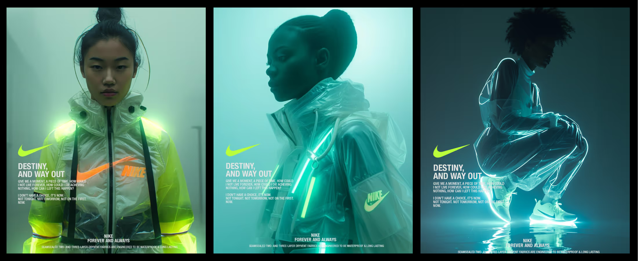
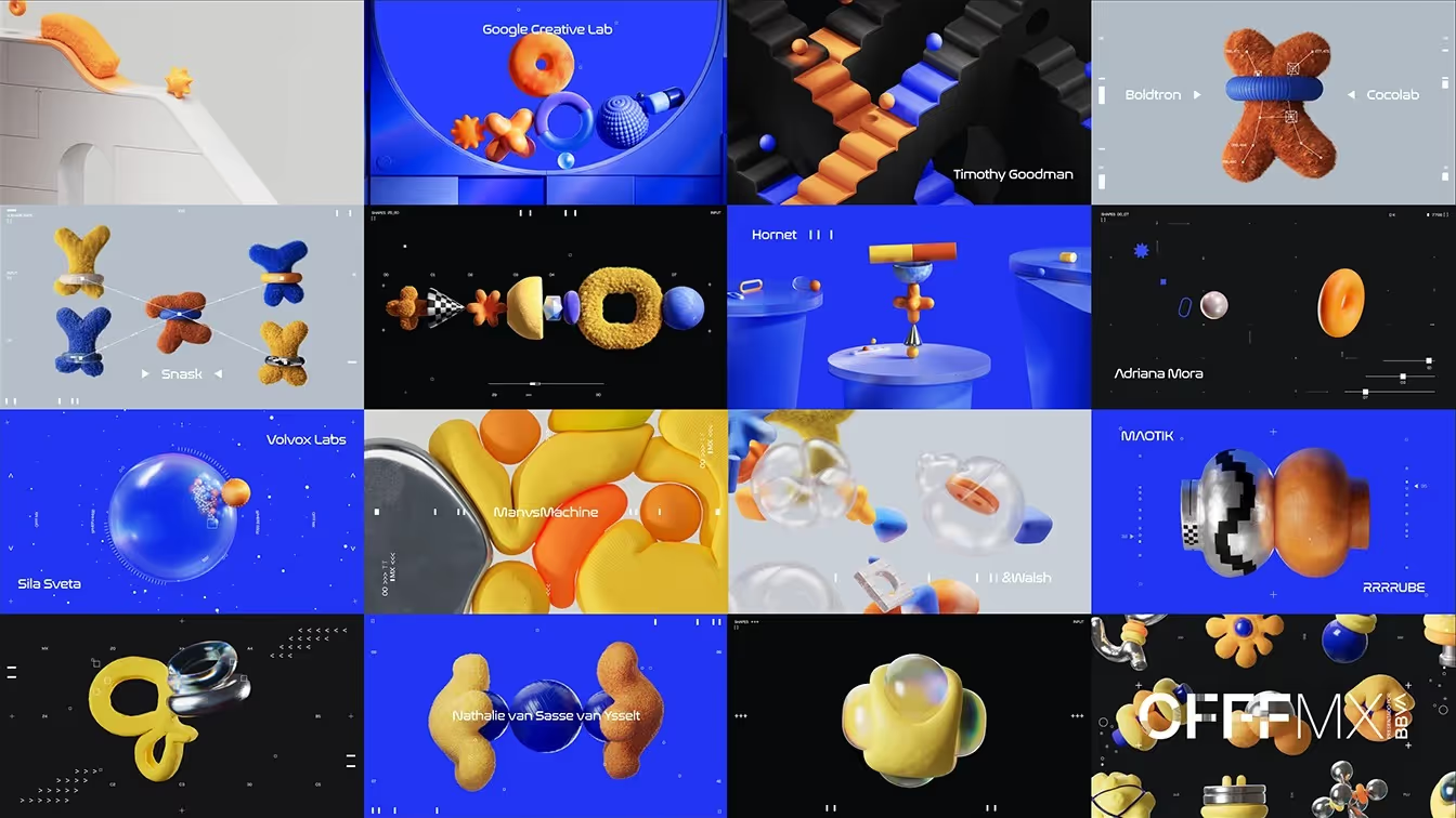
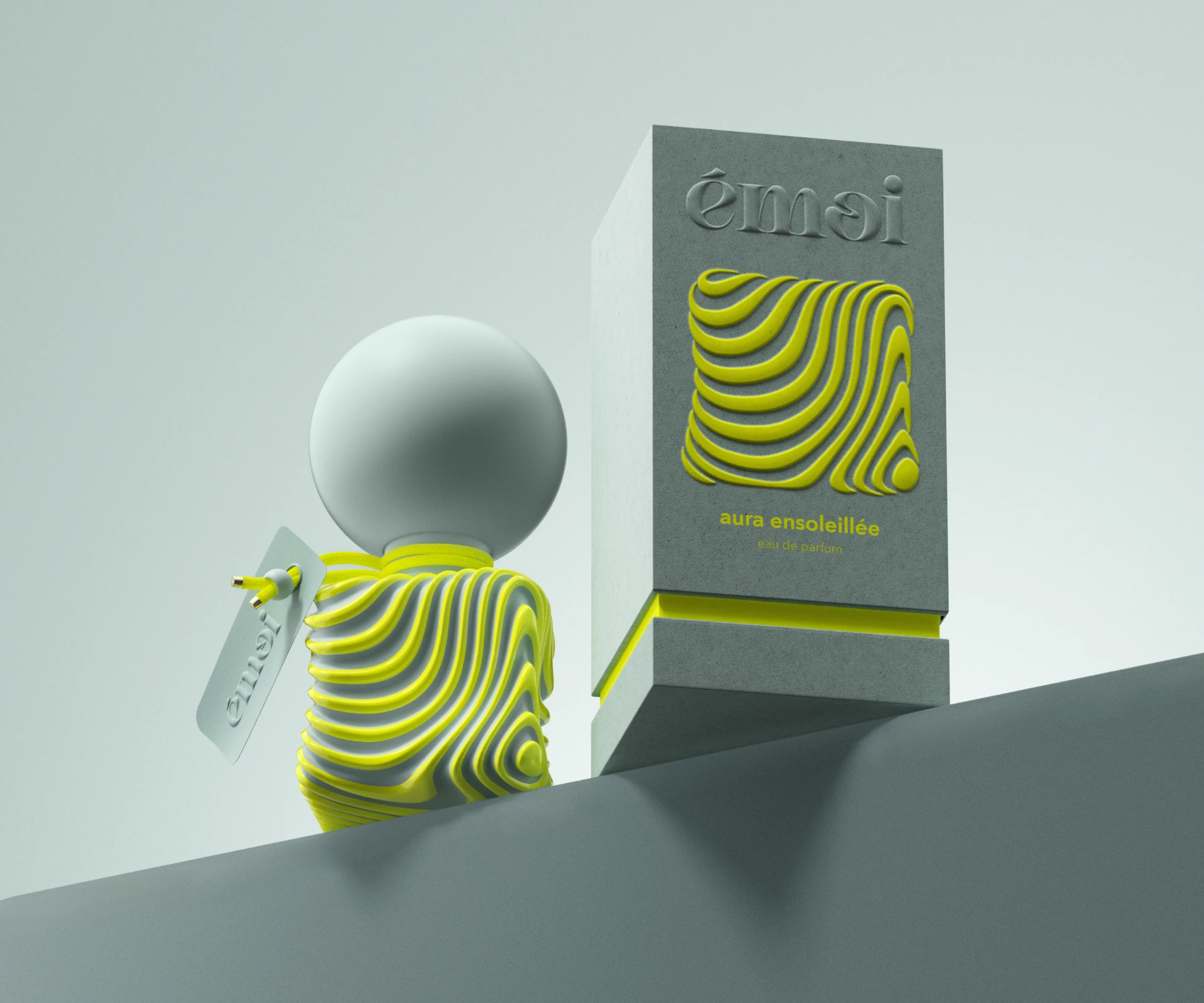
2. The Rise of Multi-Dimensional Interactivity
A visual design approach that uses dynamic, three-dimensional elements like layered objects, realistic shadows, and interactive models to create a sense of depth, movement, and visual intrigue within a digital space.

The Evolution of 3D Design
Three-dimensional design is shifting from a specialized skill to a universal visual language. AI-powered tools have made modeling, lighting, and rendering more accessible than ever. What started as simple drop shadows has evolved into fully realized 3D environments, practical for both print and digital applications, thanks to improved rendering capabilities and broader device support.
The Evolution of 3D Design
Dimensional design conveys sophistication and modernity with immediate impact. It creates a natural visual hierarchy, guiding the eye through space and suggesting premium quality. The depth and movement inherent in 3D elements evoke curiosity and engagement, making your brand feel immersive and memorable rather than flat and forgettable. For businesses, this transforms passive viewers into active participants.
Who It’s For
Ideal for industries and teams that need to overcome the imagination gap, showcase spatial detail, or convey premium value. This includes e-commerce, especially for high-ticket items like furniture and luxury goods, along with architectural and real estate firms, automotive, manufacturing, and entertainment. It is equally critical for the professionals driving these goals, such as marketers seeking higher conversion, product designers building realistic prototypes, and web designers creating sophisticated, memorable interfaces.
How to Use It
- Apply dimensional typography to headlines on posters, business cards, or social graphics. The shadow and depth make text instantly more impactful and memorable
- Design packaging concepts with 3D mockups that help stakeholders visualize the final product before printing, reducing revision cycles
- Create interactive website elements or social media carousels featuring rotatable products or layered scenes that invite exploration
3. Heritage Craft in a Hyper-Digital World
This is a deliberate visual style that emphasizes physical texture, the authenticity of handmade quality, and the luxury of premium print techniques such as embossing, foil stamping, and the use of specialty papers to create sensory, material-rich experiences that feel authentic and valuable.
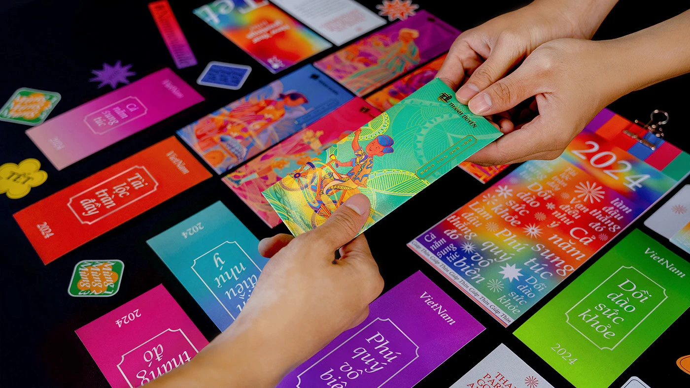
A Touch of Authenticity in a Digital World
As digital saturation increases and AI-generated content floods the market, there's renewed appreciation for materials you can touch and feel. This trend champions the tangible, celebrating the craftsmanship of letterpress, the shimmer of metallic foils, and the weight of luxurious cardstock. It's a deliberate move toward experiences that feel slower, warmer, and rooted in heritage as a counterpoint to ultra-slick digital aesthetics.
Why It Works
Tactile design creates memorable sensory experiences that digital alone cannot replicate. When someone holds a beautifully crafted business card or unboxes a textured package, they form an emotional connection with your brand. This approach signals quality, attention to detail, and a genuine investment in the customer experience, all of which translate to perceived value and brand loyalty. In 2026, tangible texture functions as a trust indicator representing what designers are calling the new luxury.
Who It’s For
It is ideal for industries where a physical touchpoint is crucial to defining brand value. This includes luxury goods, boutique hospitality, fine arts, and craft food and beverage brands, as well as high-end professional services. It is championed by brand managers, package designers, and business owners who use premium materials and specialized techniques to create memorable, sensory experiences that justify a premium and build lasting loyalty.
How to Use It
- Incorporate embossed logos or debossed patterns on business cards and stationery to create instant tactile distinction
- Specify specialty papers with visible texture, cotton, linen, or kraft stocks for invitations, menus, or promotional materials that customers will want to keep
- Add spot UV coating or foil accents to highlight key design elements on packaging, creating visual and textural contrast that feels premium
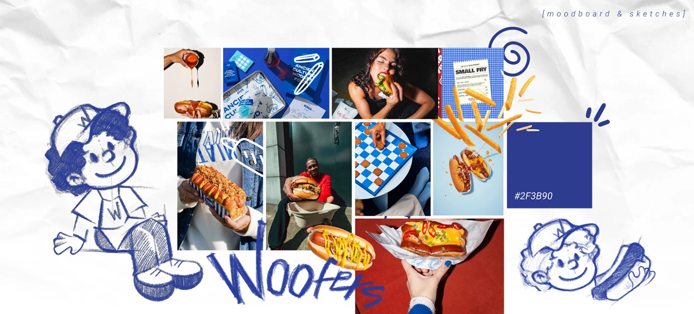
4. Mixed Media, Maximum Personality
This design approach embraces a deliberately playful and nostalgic aesthetic. It is characterized by layered, tactile compositions that combine elements like candid photographs, hand-drawn doodles, torn paper textures, digital stamps, and eclectic typography, arranged in a way that feels personal and intentionally unpolished.

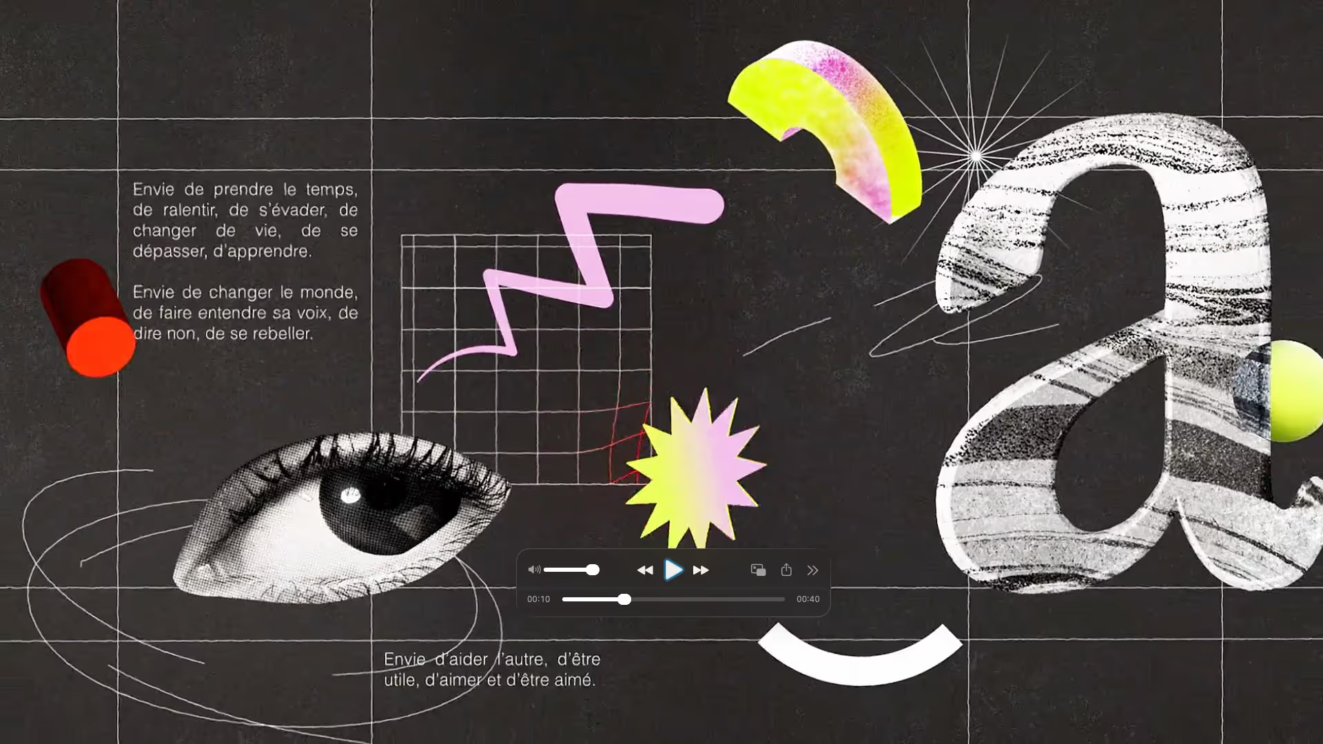
A Patchwork of Personality
Inspired by analog scrapbooking and zine culture, this trend has grown from indie aesthetics into mainstream brand applications. It reflects our desire for authenticity and creative freedom in an era of polished, algorithm-optimized content. The style mirrors how contemporary consumers absorb media, scrolling through diverse visual languages simultaneously across multiple platforms.
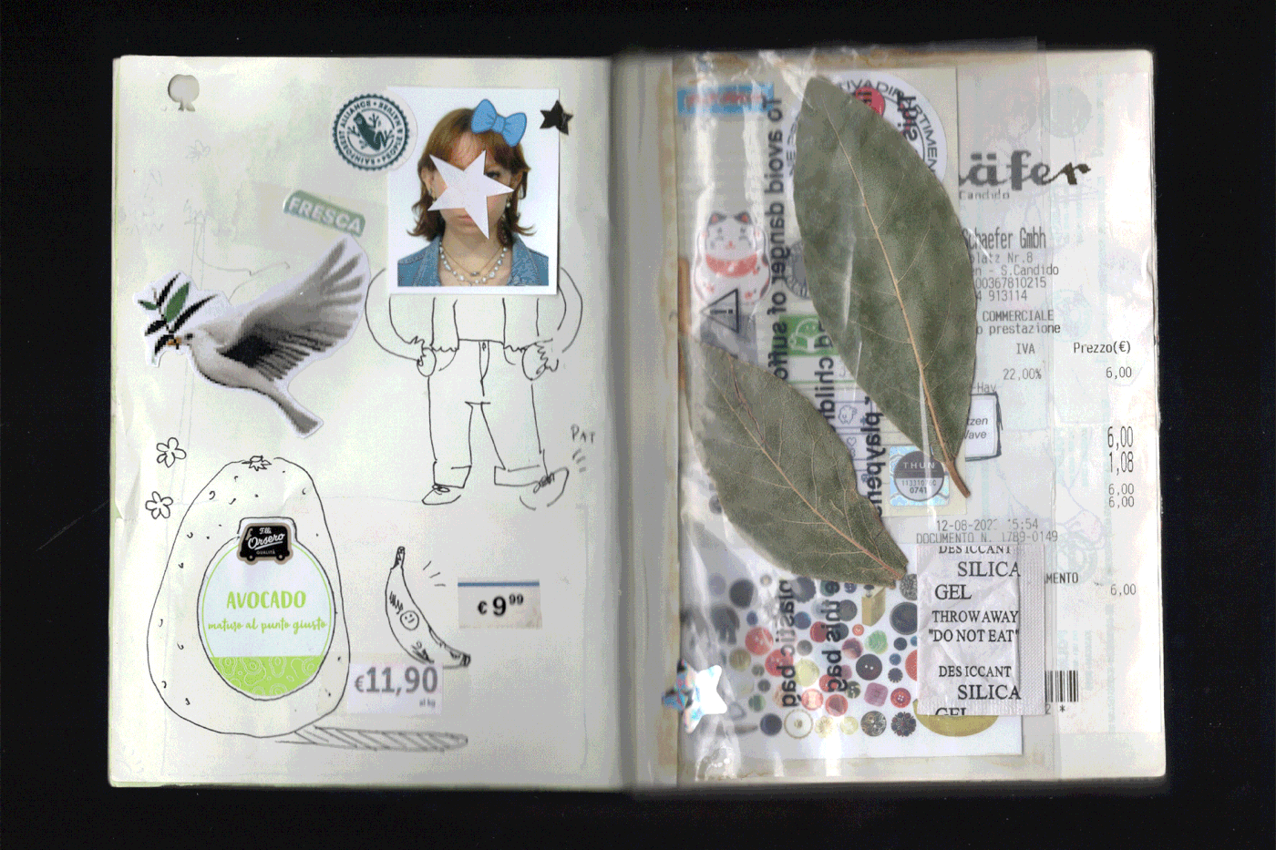
The Vibe
Scrapbook style feels personal, creative, and refreshingly human. It suggests authenticity, spontaneity, and approachability like a friend sharing their creative process. For brands, this translates to relatability and warmth, breaking down the corporate wall and inviting customers into your world with openness and vulnerability. The intentional imperfection communicates that you're confident enough to show your human side.
Who It’s For
Excellent for youth-focused fashion, indie beauty and wellness brands, the music industry, and educational platforms, as well as the broader creative economy. It is particularly valuable for roles such as social media managers, community builders, and brand storytellers. They use its unpolished, narrative aesthetic to create content that feels personal and native, fostering high-frequency, authentic connections.
How to Use It
- Create social media posts with layered elements, product photos, handwritten notes, decorative tape, and stickers for an engaging, behind-the-scenes feel
- Design packaging inserts or thank-you cards with collaged elements and personal touches that surprise and delight customers
- Build website hero sections or email headers using mixed textures and overlapping images to create visual interest without formal rigidity
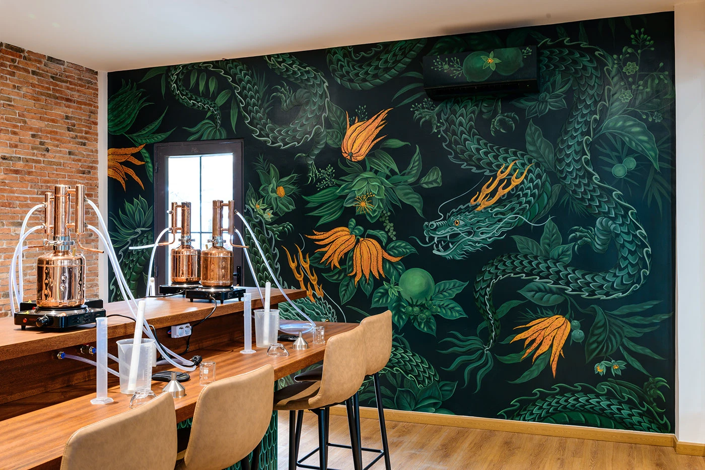
5. Nature’s Storytelling in Modern Design
This is a holistic design philosophy that integrates sustainability into its visual language. It uses organic patterns, earthy palettes, and folk art motifs to create warm, nature-inspired visuals that tell a story of environmental care and artisanal craftsmanship.
Nature, Craft, and Conscious Branding
This trend merges traditional folk art, botanical illustrations, artisan crafts, and cultural heritage patterns with contemporary environmental values. It's design that honors the earth while serving modern brand needs, moving away from cold corporate minimalism toward visual languages that feel warm and rooted in heritage.
Why It Works
Elemental folk design taps into the universal human connection to nature while aligning with growing consumer demand for sustainable and ethical brands. The aesthetic communicates wholesomeness, integrity, and rootedness. It tells customers you care about origins, quality ingredients, and environmental impact. These are values that drive purchasing decisions across demographics. The trustworthiness of traditional patterns combined with modern compositions creates a bridge between heritage and contemporary relevance.
Who It’s For
It is naturally, almost inevitably suited to sustainable industries such as organic food and beverage, natural home and personal care, eco-conscious retail, ecotourism, and artisan goods.
This approach is essential for those who carry the true weight of responsibility (sustainability officers, ethical brand owners, packaging designers) because it alone provides the quiet yet unmistakable visual language that expresses unwavering commitment, exceptional quality, and a deep, unbroken connection to natural origins.
How to Use It
- Use hand-drawn botanical illustrations or woodcut-style graphics on labels and packaging to convey natural ingredients and artisanal quality
- Build color palettes around earth tones, terracotta, sage, ochre, and clay that feel grounded and genuine across all brand touchpoints
- Incorporate folk patterns and natural textures subtly into backgrounds, borders, or accent elements to add warmth without overwhelming your message
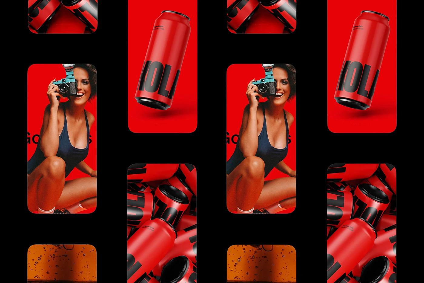
6. Design That Refuses to Behave
It is an aesthetic strategy that deliberately rejects conventional design principles. It employs clashing colors, overlapping text, jarring asymmetry, and other forms of intentional visual tension to create unconventional, attention-grabbing layouts that challenge norms and assert raw, disruptive energy.
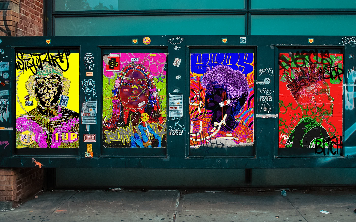
The Art of Visual Noise
Born from punk aesthetics and street culture, anti-design has moved from counterculture to commercial viability. The style borrows from the 1990s anti-design movement, where rules were intentionally broken, and too much was the objective. Brands now use controlled chaos to disrupt expectations and capture attention in oversaturated markets.
The Vibe
Chaos design is bold, confident, and unapologetically different. It communicates rebellion, authenticity, and fearlessness, which is ideal for the brands that want to challenge conventions. The energy is raw and immediate, creating visceral reactions that safe, predictable design simply can't achieve. They don't follow the rules but make their own. For the right brand, this confidence is magnetic.
Who It’s For
It thrives in youth-focused and disruptive markets like streetwear, alternative fashion, experimental craft beverages, indie music, and disruptive technology. This approach is a primary tool for challenger brands, product launch teams, and creative directors who strategically leverage its jarring, rule-breaking energy. Their goal is to carve out a distinct niche, capture immediate attention, and signal defiant authenticity.
How to Use It
- Design packaging with unexpected color combinations and overlapping type that breaks grid structures while maintaining legibility in key information
- Create scroll-stopping social media graphics with intentional imperfection, misaligned elements, clashing fonts, and energetic compositions
- Use anti-design principles for limited editions or special campaigns when you want to generate buzz and conversation around your brand
7. Elegance Through Ease and Flow
This design approach features soft, flowing forms and irregular curves that move away from rigid geometry, creating designs that feel natural, dynamic, and effortlessly modern.

Approachable Sophistication Through Organic Forms
As minimalism matured, designers sought warmth within simplicity. Organic shapes add visual interest and approachability to clean layouts, softening the sometimes stark feel of geometric modernism while maintaining contemporary sophistication. This represents a definitive move away from rigid grids toward forms that mirror nature and the human body.

Why It Works
Fluid shapes are psychologically comforting. They mirror forms found in nature and human anatomy. For brands, this creates an immediate sense of ease and approachability. The movement and flow suggest flexibility and innovation, while the softness builds trust. It's a modern design that invites rather than intimidates, ideal for brands wanting to feel cutting-edge yet welcoming.
Who It’s For
This design approach is versatile across industries, including technology, fintech, health and wellness, high-end interior design, luxury retail, and education. This approach is strategically used by UX designers, brand strategists, and creative directors who rely on its soft, flowing forms to build trust, reduce cognitive load, and convey a modern, human-centered, and calming experience.
How to Use It
- Frame photography or content blocks with organic shapes instead of rectangles on websites and presentations to add contemporary visual flair
- Design logos or brand marks using flowing, asymmetric forms that feel distinctive and memorable without geometric rigidity
- Use fluid shapes as background elements, dividers, or accent graphics in printed materials like brochures, business cards, and posters
8. The Two Voices of Modern Typography
This is a design philosophy that places typography as its core visual element. It strategically chooses between two expressive paths, using classic serif fonts to project authority and gravitas or selecting dynamic and experimental typefaces to generate energy and movement.
Type Is The Voice
Typography has always been powerful, but 2026 sees designers wielding type with new intentionality. The choice between serif authority and kinetic expression has become a deliberate brand positioning decision, with type often carrying entire compositions. There's a revival of high-contrast serifs for adding heritage and sophistication, while experimental typography dominates high-energy campaigns prioritizing movement and cultural edge.
The Vibe
Serif typography communicates heritage, stability, expertise, and trustworthiness. It is ideal for brands needing to project authority and permanence. Kinetic, experimental types radiate energy, innovation, and cultural relevance, which is perfect for brands targeting youth markets or positioning as disruptors. Both approaches use typography as voice, making your brand message instantly recognizable and emotionally resonant before audiences even read the words.
Who It’s For
This design philosophy is vital for industries where brand positioning and emotional resonance are critical. Brands use Serif Authority, such as corporate services, luxury goods, and established media, to project trust and heritage, appealing directly to audiences who value permanence. In contrast, technology, entertainment, and youth culture brands leverage kinetic expression to signal innovation and a cultural edge, resonating with those who prioritize disruption and movement.
How to Use It
- Choose a distinctive serif font for headlines and logotypes if your brand values are tradition, quality, and reliability, think editorial magazines or premium spirits
- Experiment with warped, oversized, or layered type treatments for social media, posters, and digital ads when you want immediate impact and modern edge
- Combine both approaches strategically, such as serif for body copy and brand credibility, kinetic for headlines, and attention-grabbing moments
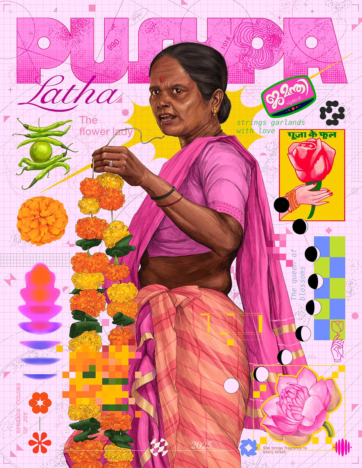
9. Charm Over Polish
This design approach uses intentionally simple and childlike illustrations, along with hand-drawn elements, to create a sense of warmth and authenticity. It embraces imperfection, playful asymmetry, and an unpolished charm to convey approachability, creativity, and human touch.
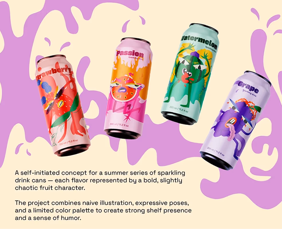
Perfectly Imperfect
In reaction to hyper-polished digital perfection and flawless AI outputs, naive design celebrates the beauty of amateur aesthetics. It's the artistic equivalent of vulnerability, showing the human hand and creative process without filters or pretense. This aesthetic deliberately uses imperfect drawing skills to create playfulness and approachability.
Why It Works
Naive design is disarming and authentic. It lowers barriers between brand and customer, creating an atmosphere of honesty and playfulness. People respond to imperfection because it feels real and relatable. For businesses, this approach builds approachability and memorability. Your brand becomes the friendly, unpretentious option in a sea of corporate polish. This signals the brand's confidence, demonstrating that it is secure enough to show its human side.
Who It’s For
This approach is ideal for consumer goods and food, creative wellness sectors, friendly tech disruptors, and sustainable fashion. It is strategically used to appeal to two key audiences: authenticity-seeking consumers who value human honesty, and youth-driven audiences who respond to playful nostalgia and cultural relevance. By openly embracing imperfection, it disarms skepticism and builds trust through genuine, unpretentious connection.
How to Use It
- Commission or create simple hand-drawn illustrations for website graphics, packaging, or social content that feel personal and inviting
- Use wobbly hand-lettering for special promotions, menu items, or signage to add charm and approachability
- Apply naive design to internal communications or behind-the-scenes content, showing your team's personality and creative process authentically
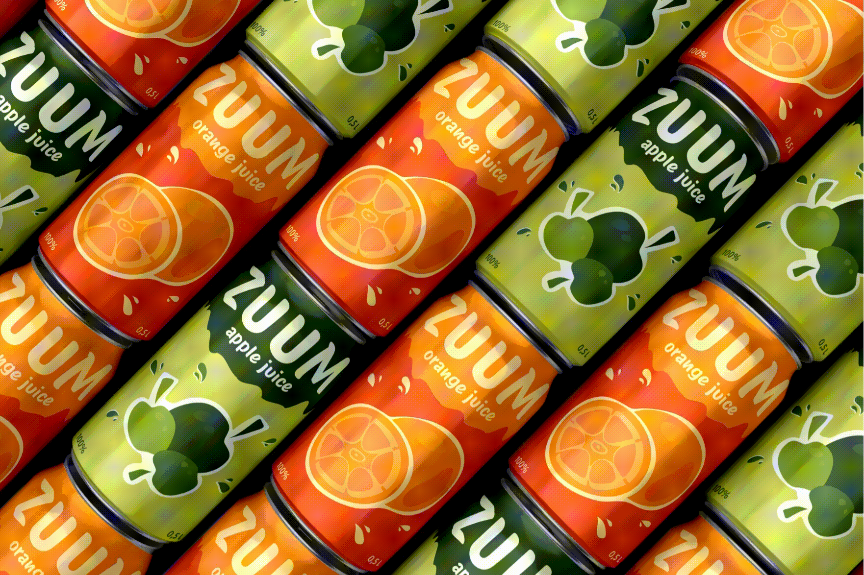
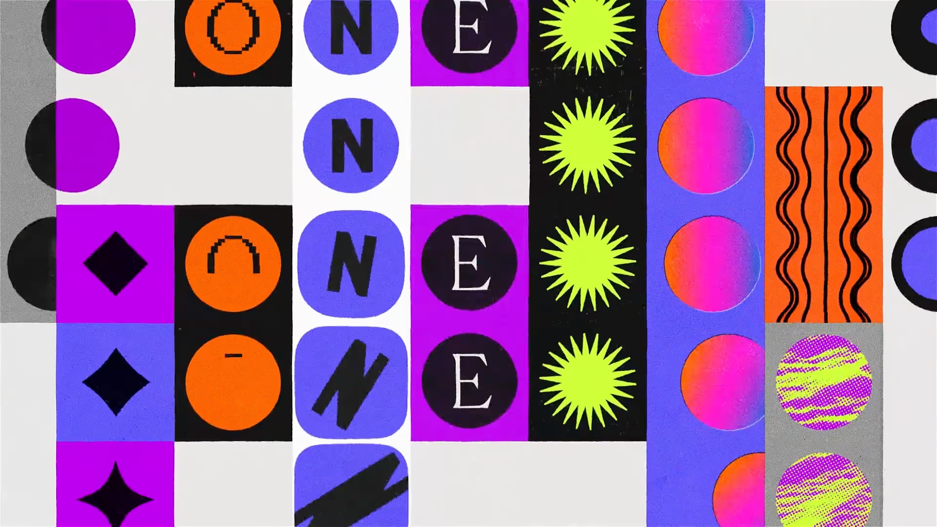
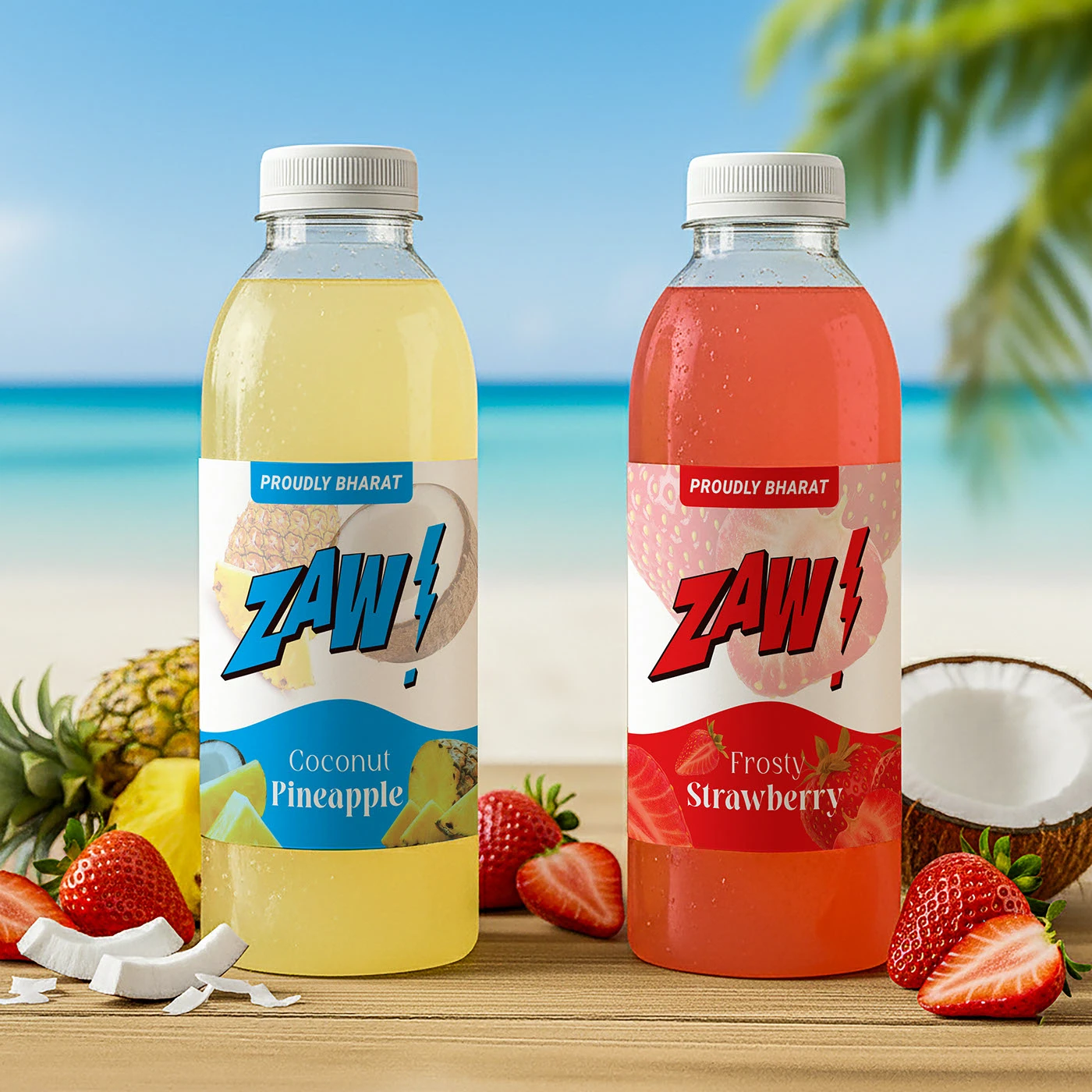
10. Maximalist Hues for Maximum Impact
This is an optimistic, high-impact color strategy featuring saturated hues, unexpected color pairings, and layered gradients designed to break through visual noise.
Unapologetically Vibrant
This trend emerged as a reaction to the muted, pastel-heavy palettes that dominated earlier digital eras. As brands competed for attention in crowded spaces, designers turned to bold, maximalist color approaches that command immediate notice. The revival explores deep jewel tones like emerald, sapphire, and ruby, occasionally introducing subtle neon accents to create visual energy. What started as experimental social content has evolved into a mainstream strategy for brands seeking cultural relevance.
Why It Works
Saturated colors are psychologically energizing and emotionally uplifting. They convey confidence, cheerfulness, and a brand personality that refuses to blend into the background. In the attention economy, where consumers rapidly scroll and swipe across platforms, bold color palettes function as visual hooks that pull the eye and hold attention. For businesses, this signals vitality and contemporary awareness. The strategic power lies in creating instant recognition by using distinctive color choices that make your brand feel joyful, intentional, and unmistakable.
Who It’s For
This design approach is ideal for industries that must break through visual noise, including technology and social platforms, media and entertainment, retail, and food and beverage. This strategy is used by designers to appeal directly to audiences in the attention economy, especially youth-driven and culturally relevant consumers. It leverages bold color as a visual hook to capture immediate notice, convey vitality, and signal cultural confidence in saturated digital spaces.
How to Use It
- Design social media templates and digital ads with saturated backgrounds and unexpected pairings like electric blue with hot pink, or deep purple with bright orange, to stop the scroll
- Apply layered gradients to website headers, app interfaces, or promotional materials, using bold color transitions that create depth while maintaining readability
- Use jewel-tone palettes with strategic neon accents for packaging, event posters, or seasonal campaigns that need to communicate celebration and high-energy brand presence.
Honorable Mentions
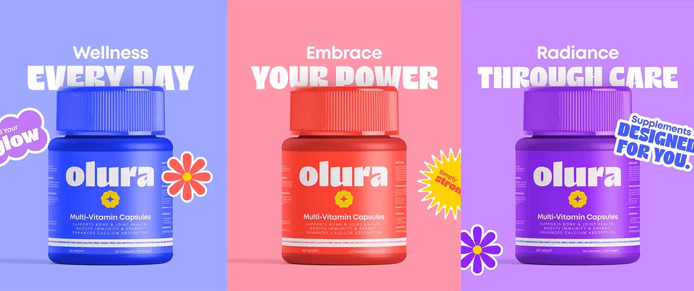
Dual Aesthetics (Split-Personality Branding)
Dual Aesthetics is a split composition that presents two distinct visual languages, color, type, imagery, or layout within a single asset to communicate dual uses, moods, or audiences at a glance.
Dual aesthetics work because the immediate contrast tells a short story instantly, making complex positioning readable in limited space. It’s ideal for brands with legitimately bifurcated offers (day/night lines, pro vs. beginner modes, before/after product states). It’s best used on product pages, launch creatives, split-screen ads, and packaging where a shared anchor, such as logo, hero object, or motion, maintains cohesion. At the same time, each side speaks to a different benefit or audience.
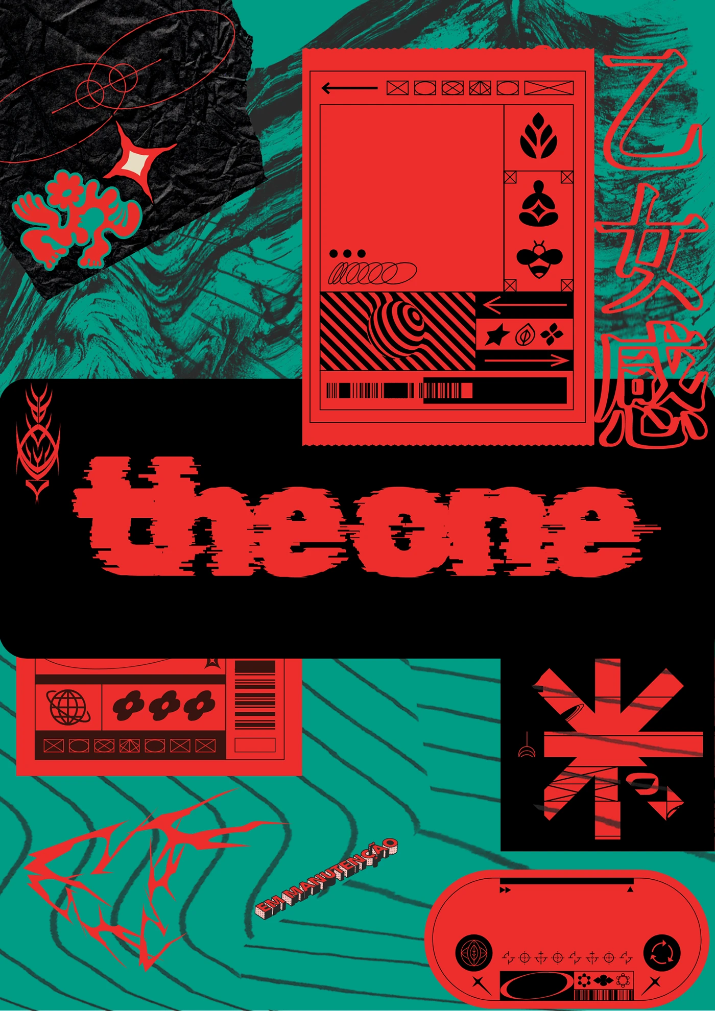
Hyper-Individualism & Digital Disruption
It is a controlled aesthetic built from intentional digital artifacts such as glitches, noise, data moshing, and distorted type that embraces technological imperfection as a creative device.
The aesthetic cuts through algorithmic sameness, signaling cultural edge and technical fluency. It is ideal for gaming, electronic music, crypto/NFT projects, avant-tech fashion, and creative cybersecurity. It should be used as an accent (animated hero frames, headers, limited-edition packaging) with clean fallbacks and measured application so the distortion amplifies identity without breaking legibility or accessibility.
Your Brand, Reimagined Through Modern Trends
The beauty of design trends lies in choosing those that authentically represent your brand's personality and goals. Experimenting with fresh visual directions is one of the most powerful ways to refresh your identity, attract new audiences, and remind existing customers why they fell in love with you in the first place.
Don't be afraid to test, iterate, and evolve. Design is a conversation with your audience, and trends are simply the vocabulary of the moment. You can blend multiple aesthetics, adapt them to your unique context, or use them as inspiration for something entirely new. The key is staying curious, bold, and confident in your creative choices.
Your brand deserves to be seen, remembered, and celebrated. Whether you're drawn to the tactile luxury of elevated print, the authentic charm of naive design, or the bold energy of chaos packaging, there's a trend here that can help you connect more deeply with the people you serve.

Ready to Launch Your
Next Website?
Let’s design and build a site that makes sense for your business.
From strategy to launch, DesignSense builds websites that move businesses forward with clarity, creativity, and purpose
