
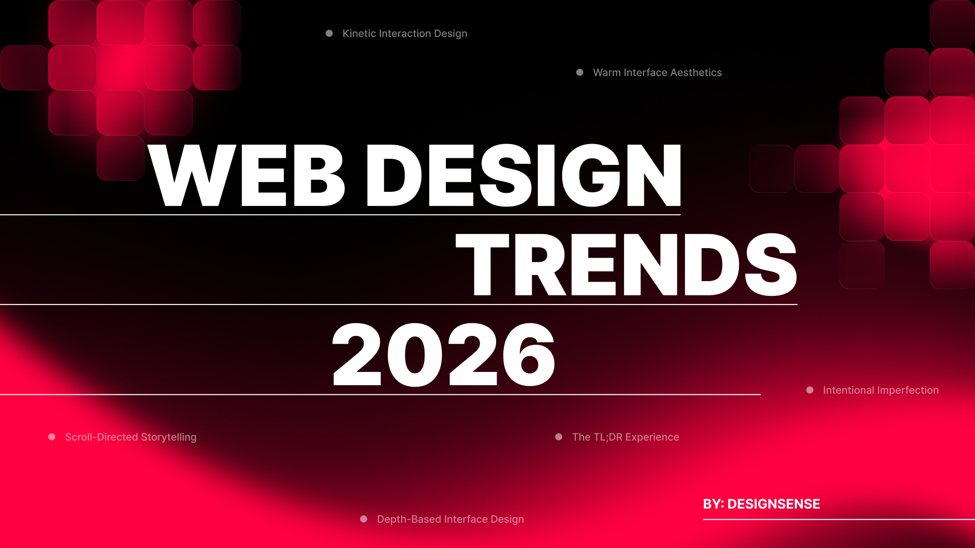
Web Design Trends of 2026 (From Static Pages to Intelligent Interfaces)
The web has outgrown its role as a display layer. What began as a medium for presenting information has become an environment where people make decisions, complete work, and expect interfaces to understand intent. Users no longer prefer passive experiences and now expect systems that respond, predict, and adapt. This shift changes how designers approach every surface, from marketing pages to internal tools.
Attention spans have compressed while expectations for sophistication have expanded. People scroll faster but notice more. They dismiss generic layouts within seconds but will spend minutes with interfaces that feel considered. Design now operates as infrastructure. It either removes friction or creates it. There is no neutral middle ground.
The trends shaping 2026 reflect this reality. Some respond to technological capabilities, such as new interaction models, computational typography, and spatial interfaces. Others address human needs, such as the desire for warmth, clarity, or controlled guidance through complex information. What connects them is intentionality. Each represents a deliberate choice about how to treat the people using what we build.
Who This Guide Is For
This analysis serves multiple roles across the design and product spectrum. Web designers and UX practitioners will find applied methods for evolving their work. Creative directors can use these patterns to inform brand system decisions and interface direction. Product designers working on SaaS platforms, dashboards, and applications will see how these trends translate beyond marketing sites.
Founders and executives building digital products need to understand where interface expectations are heading. Brand leaders managing design systems can identify which movements align with their positioning. Marketers overseeing site redesigns or campaign microsites will recognize opportunities to differentiate. Design students constructing portfolios should know what serious teams are implementing now, not what was relevant two years ago.
The trends covered here apply across contexts, including consumer-facing marketing sites, content-heavy editorial platforms, ecommerce interfaces, internal tools, onboarding flows, and product documentation. Some work better in certain environments than others. That distinction matters.
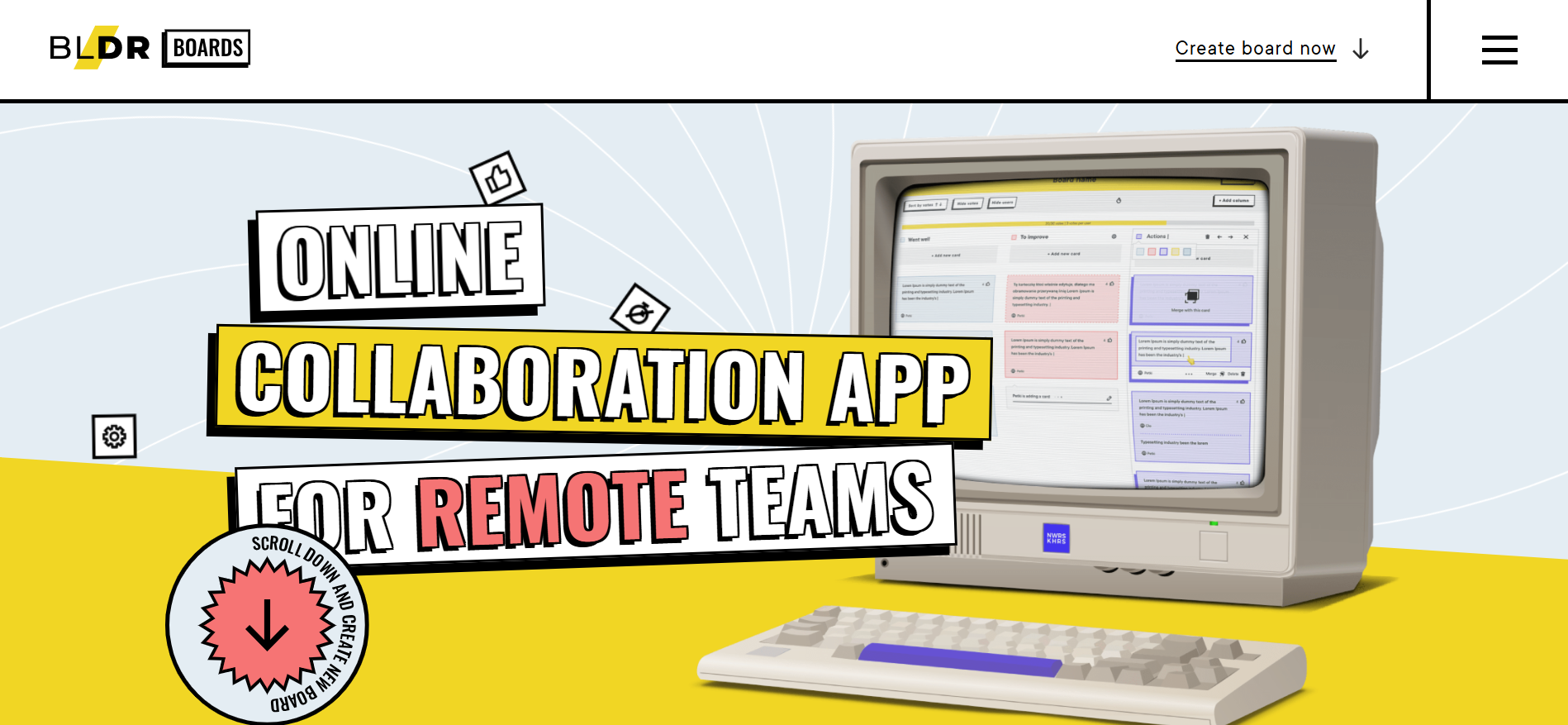
1. Action-First Interfaces
This refers to web interfaces that proactively take action on behalf of users, rather than functioning solely as information displays.
The Shift from Display to Action
The web was built to show content. Forms collect input, pages present options, and users click through sequences. This model assumes people want to navigate and choose. Agentic experiences invert that assumption. They interpret intent, execute tasks, and return outcomes. The interface shifts from passive display to active participant. Machine learning makes this feasible at scale, while natural language interfaces lower the barrier to expressing complex requests.
Why It Works
Agentic design reduces cognitive load by eliminating decision paralysis. When users face endless options, they freeze. Systems that narrow possibilities based on context, previous behavior, stated preferences, time of day, and device type remove this friction. The interface becomes a collaborator rather than a tool. Users spend less time navigating and more time accomplishing goals. This efficiency translates directly to satisfaction and retention. Businesses benefit from higher conversion rates and reduced abandonment.
Who It's For
This approach is indispensable for platforms with repeat users who value efficiency over exploration. It fits productivity tools, scheduling applications, research platforms, and personalized recommendation engines where time savings matter most. Within organizations, product managers use it to reduce user friction, developers implement it to build intelligent systems, and UX designers apply it to streamline complex workflows. It serves SaaS companies, booking platforms, enterprise software, and data-heavy applications where users return frequently and expect the system to remember their preferences and anticipate their needs.
How to Use It
- Build onboarding sequences that configure settings automatically based on role and industry rather than presenting lengthy option lists
- Design search interfaces that execute multi-step queries and surface synthesized answers instead of forcing users through result pages
- Create dashboard controls that suggest actions based on data patterns rather than waiting for manual review
- Implement commerce checkouts that pre-populate shipping, payment, and delivery preferences from prior orders
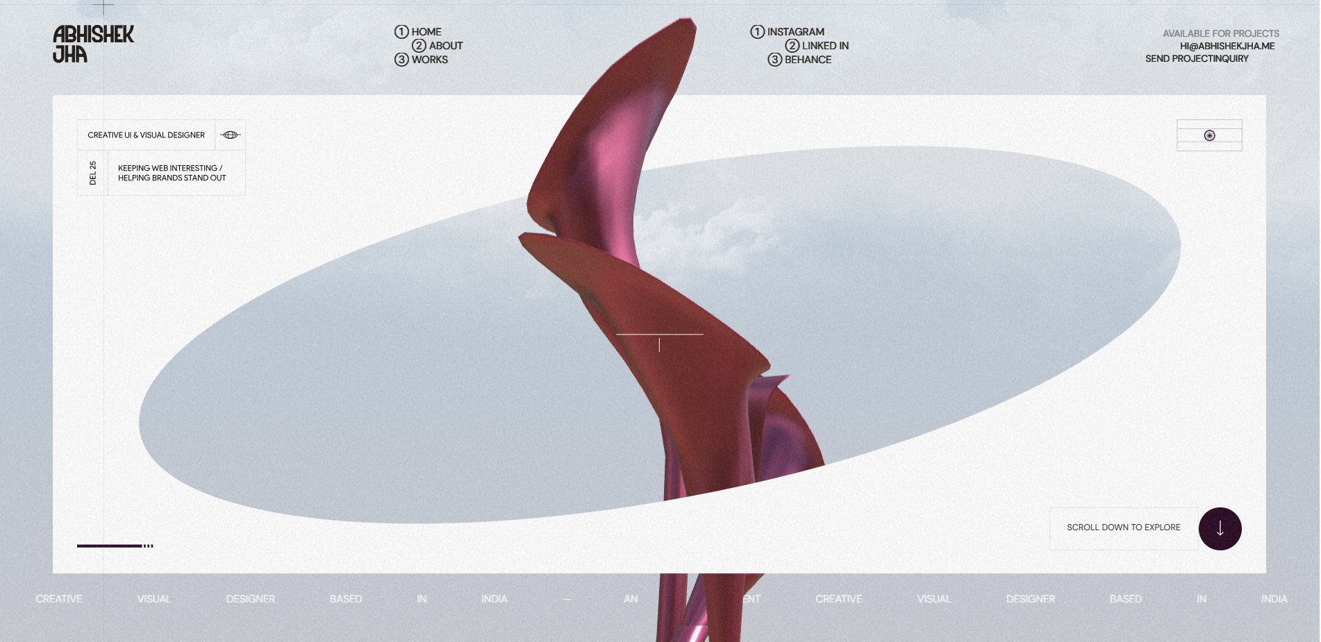
2. Art-Directed Interfaces
This approach integrates fine art techniques, unconventional compositions, and expressive visual treatments into functional interfaces.
Breaking the Minimalism Monopoly
Interface design has prioritized usability over aesthetics for two decades. This created clean, efficient systems that often lack personality. Art-infused UI reclaims visual expression without sacrificing function. It applies illustrative techniques, painterly textures, asymmetric layouts, and hand-crafted elements to working interfaces. Advances in performance and browser capability now support richer visual treatments without degradation. Designers trained in both digital and traditional media are bringing cross-disciplinary skills to product work.
The Impact
Art-forward design signals care and originality. It communicates that a brand has a point of view. Users respond to interfaces that feel authored rather than templated. When executed well, this approach improves comprehension by creating a visual hierarchy through artistic emphasis rather than generic weight and size adjustments. It makes interfaces more memorable, which directly impacts brand recognition and user retention. The differentiation is immediate and visceral.
Who It's For
This direction fits creative industries, cultural institutions, luxury brands, and consumer products where aesthetic distinction matters. It works for marketing sites, campaign pages, and customer-facing applications that need to stand out in crowded markets. Creative directors use it to express brand personality, web designers apply it to create memorable experiences, and marketing teams rely on it for differentiation. The approach requires skilled art direction and extended production time, making it ideal for teams with visual design resources and projects where impact matters more than speed.
How to Use It
- Design hero sections that use custom illustration and collage techniques integrated with interactive elements
- Build navigation systems that incorporate hand-drawn markers, organic shapes, or artistic highlighting
- Create product pages that blend photography with painted overlays or textural treatments
- Develop form interfaces that use illustrative feedback states instead of standard UI icons
3. The TL;DR Experience
These interfaces are designed for immediate comprehension while offering progressive disclosure for users who seek greater depth.
Respecting User Time and Context
Dense content loses readers. Long articles go unread. Product documentation remains unopened. Users want answers, not reading assignments. TL;DR design prioritizes scannable summaries while preserving access to complete information. It acknowledges that different users need different depths at different times. This pattern responds to information overload and declining reading time. People scan before they read. Mobile usage rewards concision.
Why It Works
The approach works by respecting time and choice. A summary costs seconds. A full article costs minutes. Giving users control shows respect for their context. It also improves conversion because people who understand the core value proposition quickly are more likely to engage deeply later. Clear hierarchies reduce abandonment. Users appreciate interfaces that let them choose their level of engagement rather than forcing lengthy consumption upfront.
Who It's For
TL;DR design is indispensable for content platforms, documentation sites, news outlets, educational resources, and technical writing. It benefits any context where information density is high and user attention is limited. Content strategists use it to improve engagement metrics, UX writers apply it to create scannable copy, and product teams implement it to reduce drop-off rates. It serves publishing platforms, SaaS documentation, knowledge bases, marketing sites with complex offerings, and any team struggling with user comprehension or completion rates.
How to Use It
- Create article templates with prominent summary blocks above the fold and expandable sections for detailed content
- Design product pages that show key specifications and benefits immediately while hiding technical details behind "View full specs" interactions
- Build documentation that leads with quick-start examples before diving into comprehensive reference material
- Develop landing pages that communicate value in three lines while offering case studies and testimonials through scroll or tab navigation
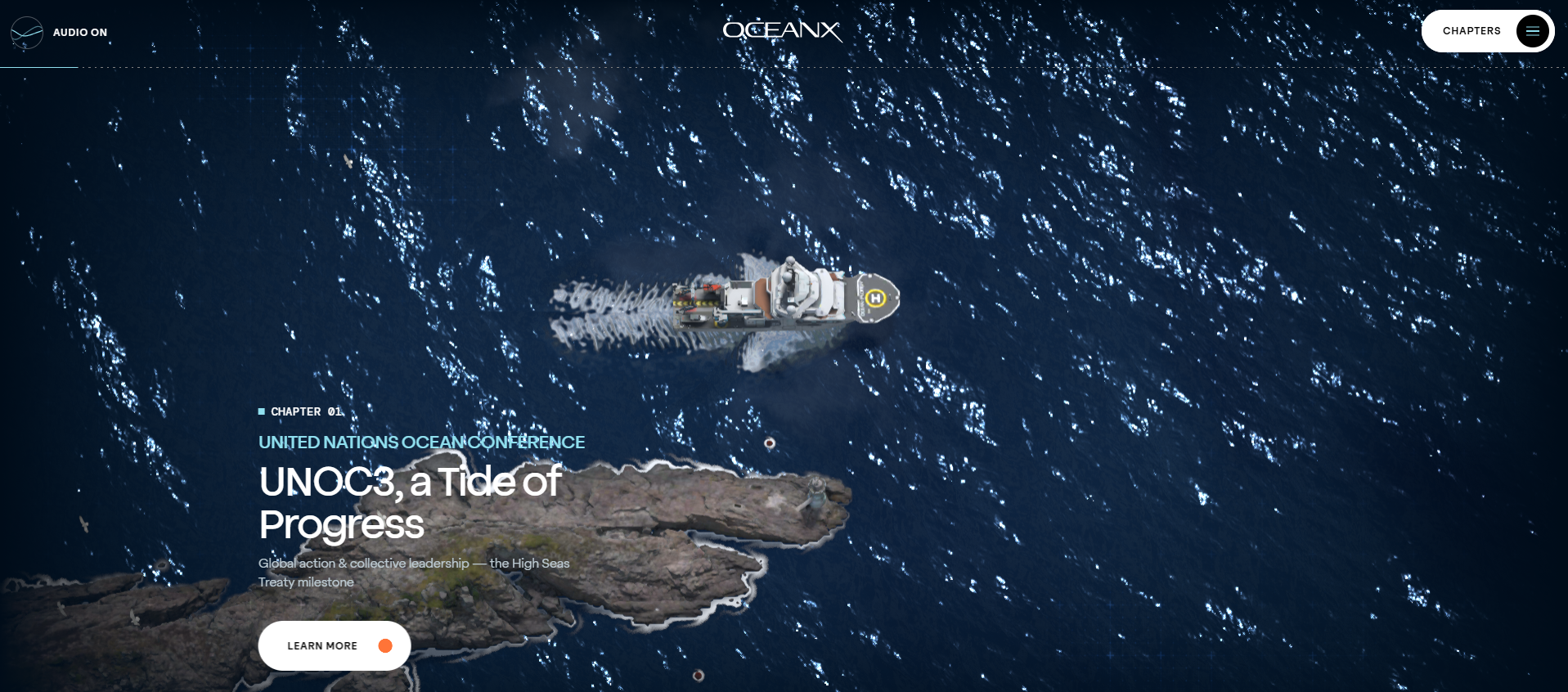
4. Scroll-Directed Storytelling
These are scroll-based interactions that control pacing, direct attention, and create structured narrative experiences.

From Transportation to Choreography
Most sites treat scrolling as transportation. Users move down the page to access more content. Guided scrolling turns this into choreography. It uses scroll position to trigger animations, reveal information, and control sequencing. The user still controls pace, but the interface shapes how content appears and when. This technique addresses the problem of attention drift. Long pages lose users halfway down. Information presented all at once overwhelms.
Why It Works
Guided scrolling maintains engagement by transforming passive scrolling into active revelation. It creates rhythm. Users feel they are progressing through a structured experience rather than scanning an undifferentiated page. Each scroll increment reveals something like a new section, an animated diagram, or a product detail. This triggers curiosity and forward momentum. It also allows designers to control information sequence, which matters when explaining complex concepts or telling brand stories.
Who It's For
This approach suits storytelling websites, product launches, case studies, annual reports, and portfolio presentations where narrative sequence matters and visual impact is a priority. Web designers use it to create memorable experiences, creative directors apply it for brand storytelling, and product marketers rely on it for launches that need impact. It requires development time and careful testing across devices, making it ideal for teams with technical resources and projects where user engagement justifies the investment.
How to Use It
- Build product pages that reveal features one at a time as users scroll, with each section animating into view
- Create case studies that scroll horizontally through project phases with triggered media playback
- Design about pages that use parallax to layer company history, team information, and values
- Develop portfolio sites that transition between project previews and detailed breakdowns based on scroll depth
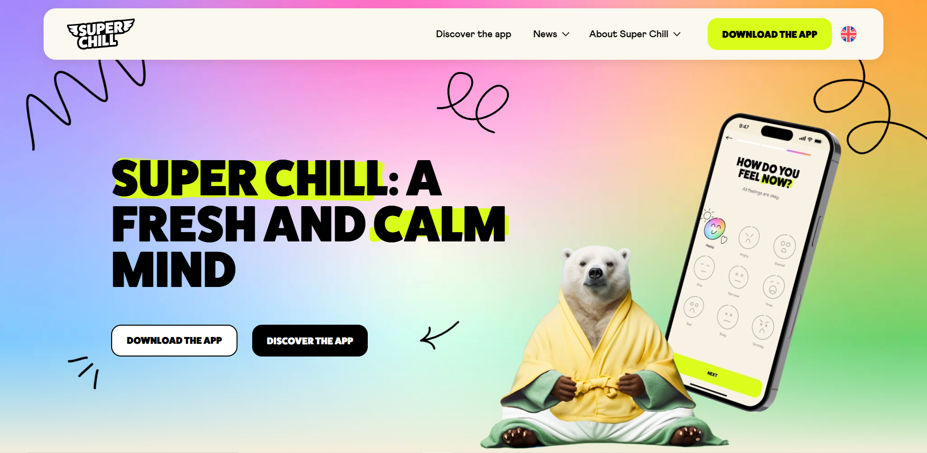
5. Warm Interface Aesthetics (Cute-alism)
This concept describes a playful and approachable visual language defined by rounded forms, friendly characters, and warm color palettes.
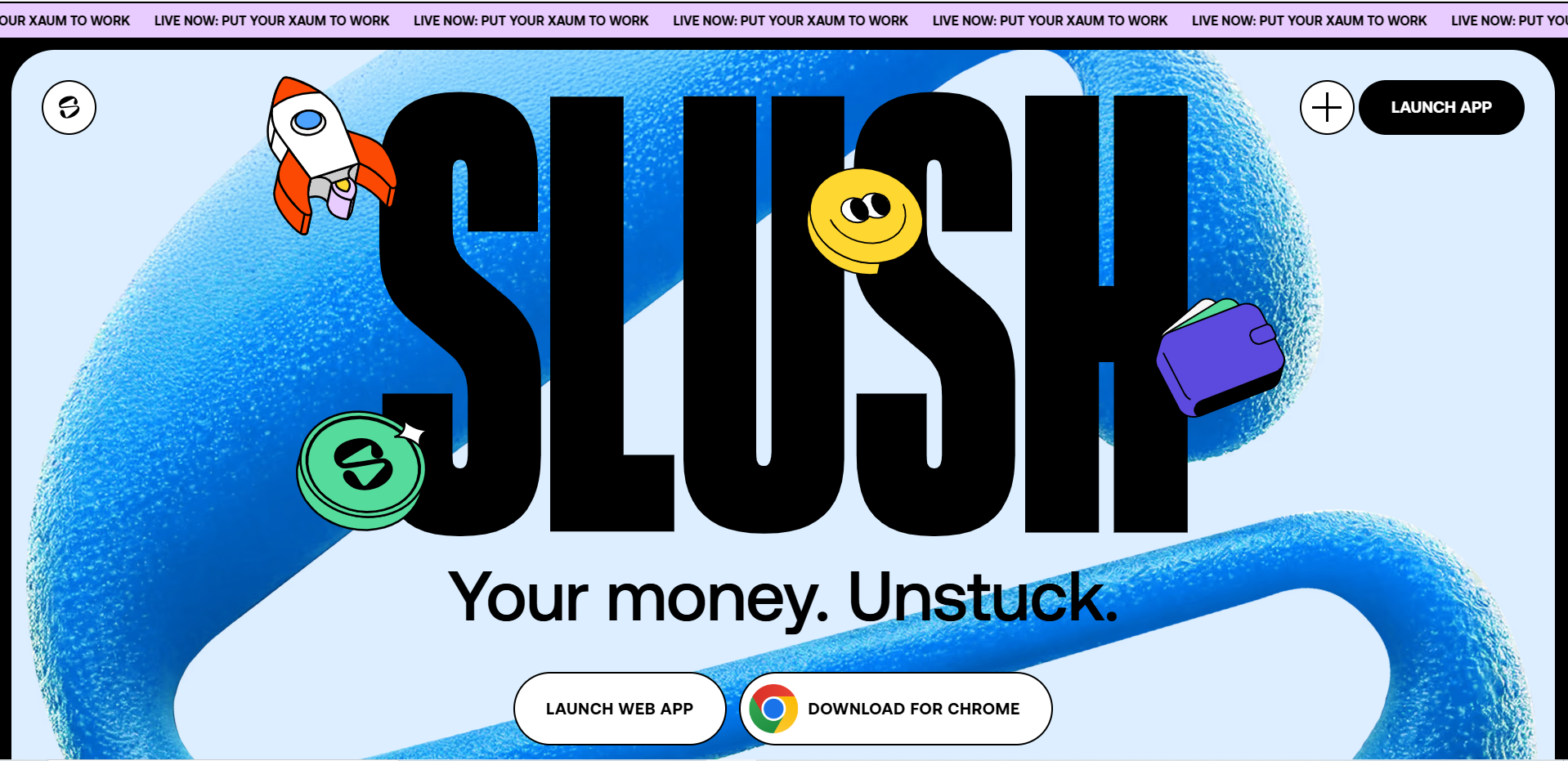
Countering Interface Intimidation
Corporate design has been cold. Sharp angles, monochrome palettes, and austere typography communicate seriousness but not approachability. Cute-alism counters this with softness. Rounded corners, cheerful illustrations, gentle animations, and friendly micro-copy make interfaces feel welcoming. This is not a childish design. It is warmth applied to grown-up products. The trend responds to interface anxiety. People feel intimidated by complex software.
Why It Works
Cute-alism reduces emotional friction. When an interface feels approachable, users try things. They experiment rather than hesitate. They interpret errors as helpful guidance rather than punishment. This increases engagement and retention. The style also differentiates brands in crowded markets where everyone defaults to minimal corporate aesthetics. Users remember brands that made them feel comfortable and confident.
Who It's For
This direction fits consumer applications, productivity tools targeting non-experts, education platforms, wellness products, and community-focused services. It works for onboarding experiences, first-time user flows, and interfaces aimed at broad audiences. UX designers use it to reduce user anxiety, product teams apply it to improve activation rates, and brand managers rely on it for differentiation in competitive markets. The approach is particularly valuable for companies serving everyday users rather than technical experts.
How to Use It
- Design empty states that use friendly illustrations and encouraging language rather than stark "no results" messages
- Create form validation that provides gentle, character-driven feedback instead of red error text
- Build loading states with playful animations that entertain rather than showing generic spinners
- Develop dashboard interfaces that use warm colors and rounded containers to make data feel less intimidating
6. Depth-Based Interface Design
These interfaces use three-dimensional space, depth, and spatial relationships to organize information and interaction.
Depth as Organizational Principle
Flat design dominated for a decade. Everything existed on a single plane. Spatial UI reintroduces depth, not for decoration but as an organizational principle. It uses Z-axis positioning, parallax, and three-dimensional environments to create hierarchy and context. This makes complex interfaces more comprehensible by using physical space as a metaphor. Advances in WebGL, Three.js, and browser rendering make performant 3D experiences practical.

Why It Works
Spatial design matches the interface to the mental model. People think spatially. They organize concepts in clusters, layers, and zones. Representing information this way reduces cognitive load. It also creates memorable experiences. Users remember where things are located in space more easily than where they appear in flat scrolling lists. The novelty of spatial interfaces commands attention and signals innovation.
Who It's For
This approach serves data visualization platforms, product configurators, immersive brand experiences, and architectural or design-focused sites. It works when visual impact matters and when the product benefits from spatial metaphor. Web developers implement it to create standout experiences, creative technologists push its boundaries, and product designers use it when traditional interfaces feel limiting. The approach requires significant development resources, making it suitable for teams with technical capability and projects where differentiation justifies the investment.

How to Use It
- Build product galleries that let users rotate, zoom, and examine items in three-dimensional space
- Create portfolio presentations that organize projects in virtual rooms or spatial layouts
- Design data dashboards that layer information in depth, with the ability to navigate between planes
- Develop onboarding experiences that walk users through spatial environments representing product features
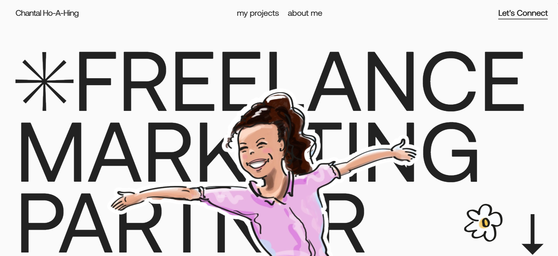
7. Intentional Imperfection
Digital interfaces increasingly incorporate hand-drawn elements and sketch-like aesthetics to introduce imperfection and personality.

Authenticity Through Imperfection
Digital design is precise. Every pixel aligns to a grid. Every curve uses mathematical Bezier paths. This precision creates visual perfection that can feel sterile. Human scribble introduces imperfection intentionally. Hand-drawn underlines, sketch-style icons, loose handwriting, and organic shapes inject personality and humanity into otherwise polished interfaces. As interfaces become more algorithmically generated, human marks signal authenticity.
Why It Works
The technique creates intimacy. Imperfection feels honest. It suggests the maker's hand rather than the machine's output. This builds trust with users who value authenticity. It also draws attention because a hand-drawn arrow or highlight stands out against crisp typography and clean layouts. The technique adds warmth without requiring full illustration. Users respond to the personal touch.
Who It's For
Human scribble fits creative agencies, independent makers, boutique brands, and personal services. It works for marketing sites, portfolio presentations, and editorial content where personality matters. Designers use it to add character, brand teams apply it to differentiate, and content creators rely on it to feel more approachable. The style requires restraint because overuse undermines its impact. It serves teams that want to communicate craft and care.
How to Use It
- Design call-to-action buttons with hand-drawn circles or arrows pointing to them
- Create testimonial sections that use handwritten-style quotation marks or highlights
- Build navigation elements that include sketch-style underlines or marks indicating the current location
- Develop infographics that blend data visualization with hand-drawn annotations and labels
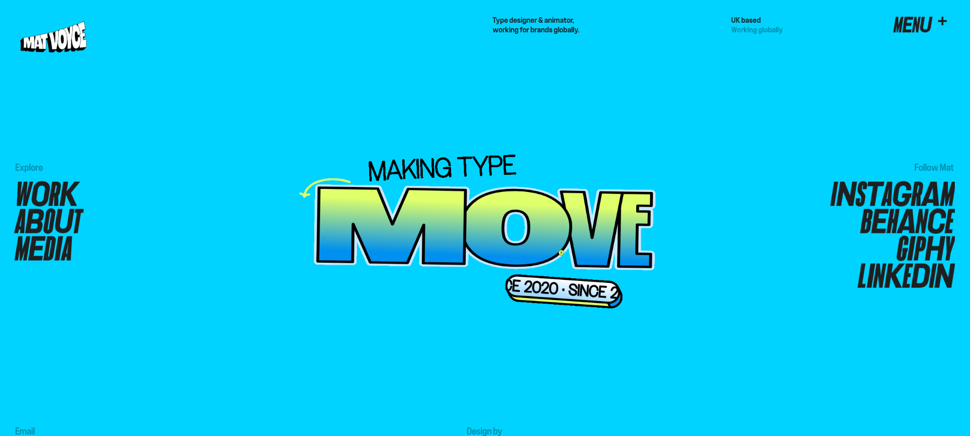
8. Variable Typography & Maximalist Type
This approach uses expressive, large-scale typography, incorporating variable font technology, animated letterforms, and type as a primary visual element.

Type as Experience
Typography has been functional. Set the headline, choose a readable size, and move on. Variable typography treats type as the main visual material. Oversized letters, animated weights, responsive letterforms that shift based on interaction, and type layouts that fill entire screens turn text into an experience. Variable font technology allows a single font file to contain multiple weights, widths, and styles that can animate between states.
Why It Works
Maximalist type commands attention. Large, confident typography communicates brand authority. Variable animations create dynamism without requiring video or complex graphics. Type-forward layouts also improve accessibility when executed well because larger text is easier to read and fewer visual elements reduce distraction. The approach differentiates brands through typographic voice rather than imagery.
Who It's For
This technique suits brands with strong verbal identities, editorial sites, creative portfolios, and marketing pages where messaging is the core value proposition. It works when text content is limited and impactful. Type designers push the boundaries of variable fonts, web designers implement them for impact, and brand teams use them to stand out. The approach requires high-quality typography and skilled type treatment.
How to Use It
- Design landing page heroes that use enormous, animated typography as the primary visual with minimal supporting graphics
- Create article templates where headlines expand and contract based on scroll or hover
- Build product pages that animate feature names from light to bold as users navigate through content
- Develop brand identity sites that use variable type to create responsive, breathing layouts
9. Kinetic Interaction Design
This approach uses subtle animations, state transitions, and feedback mechanisms to guide users and confirm their actions.

Closing the Feedback Gap
Static interfaces leave users guessing. Did the button click register? Is something loading? Micro-interactions answer these questions through small, purposeful animations. A button that depresses slightly on click. A form field that shakes when input is invalid. A card that lifts on hover. These details confirm system response and guide user behavior. Motion provides confirmation immediately.
Why It Works
Micro-interactions match human expectations. Physical objects respond to touch. Digital interfaces should, too. Small animations also teach users how a system behaves. A drawer that slides out shows where content lives. A button that changes color indicates clickability. These cues reduce learning time and errors. When applied consistently, they create interface coherence. Users feel in control because the system responds predictably.
Who It's For
This approach benefits all digital products, but especially applications with frequent user actions such as productivity tools, dashboards, forms, settings pages, and navigation systems. UX designers use it to improve usability, developers implement it to add polish, and product teams rely on it to increase satisfaction. It requires thoughtful animation design and development time, but pays dividends in usability and user confidence.
How to Use It
- Build button states that include subtle scale, shadow, and color transitions on hover and press
- Create form fields that animate label movement, border color, and helper text based on focus and validation states
- Design card components that respond to hover with lift effects and reveal additional information through smooth expansion
- Develop navigation menus that transition states with easing and timing that make hierarchical relationships clear
10. Future-Past Aesthetics
This refers to visual styles that draw inspiration from past decades, especially the 80s, 90s, and early web, while being updated with modern design capabilities.
Mining the Past for Future Direction
Design moves in cycles. The minimalism that dominated the 2010s has exhausted itself. Retro-futurism mines past aesthetics for inspiration, such as chrome effects, neon gradients, geometric patterns, pixelated graphics, and early web vernacular. This is not simple nostalgia. It combines historical visual language with current interaction patterns and performance. Younger designers and users find early digital aesthetics fresh. Older audiences experience pleasant recognition.
Why It Works
The aesthetic creates distinctiveness and emotional connection. Familiar visual references trigger memory and association. They make interfaces feel less corporate and more cultural. When executed well, the approach demonstrates design sophistication because it references history while building something current. The differentiation helps brands stand out in markets saturated with gradient backgrounds and rounded corners.
Who It's For
Retro-futurism fits entertainment properties, creative tools, gaming-related products, music platforms, and youth-oriented brands. It works for campaigns, limited releases, and brand refreshes seeking differentiation. Web designers use it to create distinctive experiences, brand teams apply it to connect with specific demographics, and creative directors rely on it when standard aesthetics feel too safe. The style requires strong visual craft to avoid appearing amateurish.
How to Use It
- Design landing pages that use Chrome text effects and neon glow, but with smooth modern animations
- Build product interfaces that incorporate pixel art iconography within clean, functional layouts
- Create dashboard designs that reference early computer interfaces through grid systems and terminal-inspired typography
- Develop marketing sites that blend 90s geometric patterns with contemporary spacing and interaction design
Applying What Works
These trends are instruments, not instructions. Each solves specific problems and serves certain contexts. The discipline lies in choosing which to use and when to ignore them. Not every interface benefits from spatial design. Not every brand should adopt cute-alism. The skill is in matching patterns to purpose.
Good design remains focused on clarity, efficiency, and respect for the people using what we build. Trends provide vocabulary and technique. They expand the available toolkit. Designers who understand these patterns can apply them selectively, adapting them to serve specific goals rather than following them mechanically.
The web continues to change because human expectations change. What felt sufficient last year now feels basic. What seemed impossible becomes expected. Design practice requires staying aware of these shifts while maintaining judgment about which directions serve users rather than just appearing current. That balance defines the difference between trends and craft.

Ready to Launch Your
Next Website?
Let’s design and build a site that makes sense for your business.
From strategy to launch, DesignSense builds websites that move businesses forward with clarity, creativity, and purpose
